Histograms and Boxplots
Histograms show the overall shape and spread of the data distribution and box plots summarise key statistics (median, spread, and potential outliers) and are particularly helpful for comparing distributions across groups.
Summary Statistics
# Example data
data <- data.frame(age = c(2,  45, 56, 47, 67, 67, 68, 72, 75, 80, 85,86, 89,125))
head(data)
age
1 2
2 45
3 56
4 47
5 67
6 67What is the distribution of the age data? What are the mean, median and standard deviation?
Other data distribution descriptors include quantiles, which divide data into equal-sized intervals:
0% (Minimum) 25% (Q1, First Quartile) 50% (Median, Second Quartile) 75% (Q3, Third Quartile) *100% (Maximum)
Quantile <- quantile(data$age)
Quantile
0% 25% 50% 75% 100%
2.00 58.75 70.00 83.75 125.00 The IQR (Interquartile Range) measures the spread of the middle 50% of your data.
If you look at the Quantile results above, you can calculate it from \(IQR=Q3−Q1\), where Q3 is the value beyond which 75% of your data lies. What is then Q2? The value beyond which 25% of your data lies.
IQR <- IQR(data$age)
IQR
[1] 25Can do it in a single go:
summary(data$age) Min. 1st Qu. Median Mean 3rd Qu. Max.
2.00 58.75 70.00 68.86 83.75 125.00 As we saw, lots of different datasets can end up with these summary statistics, so lets plot it to get real insight about what is happening:
Histogram in R
A histogram is a way to visualise the frequency distribution of a dataset. It groups data into bins and shows how many data points fall into each bin
ggplot(data, aes(x = age)) +
  geom_histogram()
`stat_bin()` using `bins = 30`. Pick better value with `binwidth`.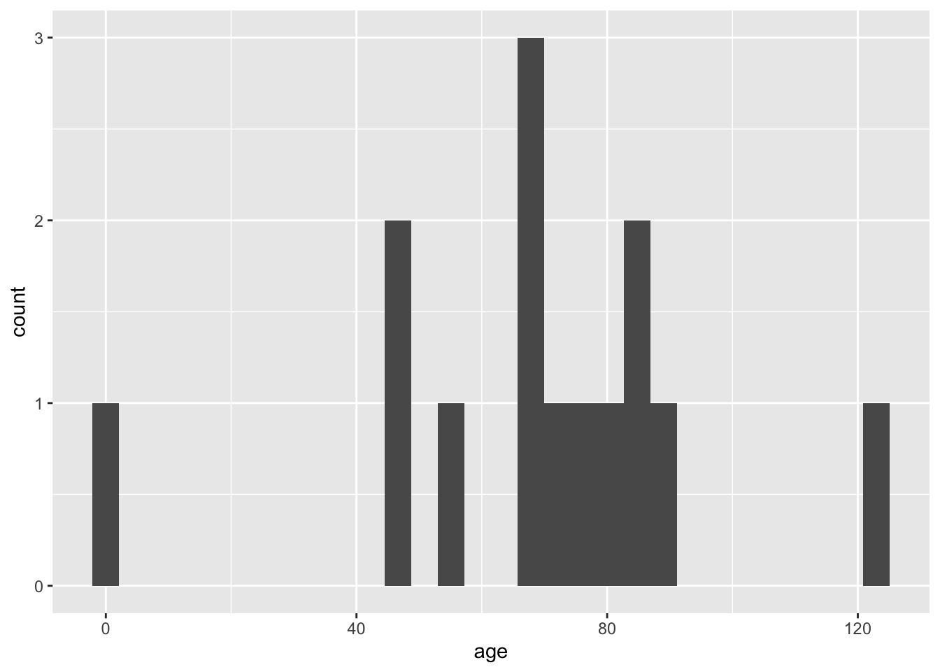
You can modify the binwidth parameter, what is happening here?
ggplot(data, aes(x = age)) +
geom_histogram(binwidth = 30) 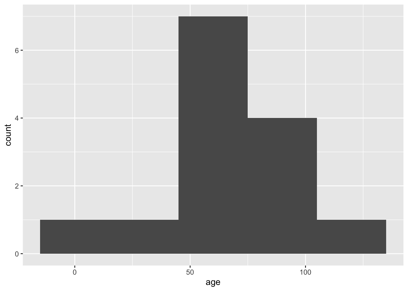
Now lets go back t original and add the mean and median
ggplot(data, aes(x = age)) +
  geom_histogram() +
  geom_vline(xintercept = Mean, color = "red", linetype = "dashed", size = 1) +
  geom_vline(xintercept = Median, color = "blue", linetype = "dashed", size = 1)
Warning: Using `size` aesthetic for lines was deprecated in ggplot2 3.4.0.
ℹ Please use `linewidth` instead.`stat_bin()` using `bins = 30`. Pick better value with `binwidth`.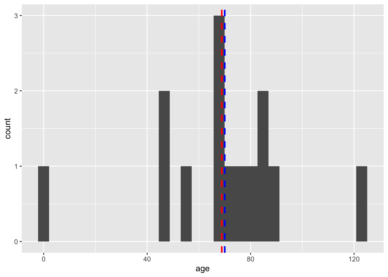
If do not remember how ggplot works , here is a cheatsheet: https://rstudio.github.io/cheatsheets/html/data-visualization.html
In summary, a histogram helps you understand the shape of your data distribution (e.g., normal, skewed) and peaks indicate the most frequent values.
Box Plot in R
A box plot (or box-and-whisker plot) summarises the distribution of a dataset. It highlights:
- Median (middle line in the box).
- Quantiles (the box spans from the 25th percentile to the 75th percentile)
- IQR (Interquartile Range): The difference between the 75th and 25th percentiles - (IQR range calculated above)
- Whiskers: Extend to data points within 1.5*IQR (above or beyond = outliers)
ggplot(data, aes(x = age)) +
  geom_boxplot() +
  coord_flip() #have you checked what this does? Take it out and see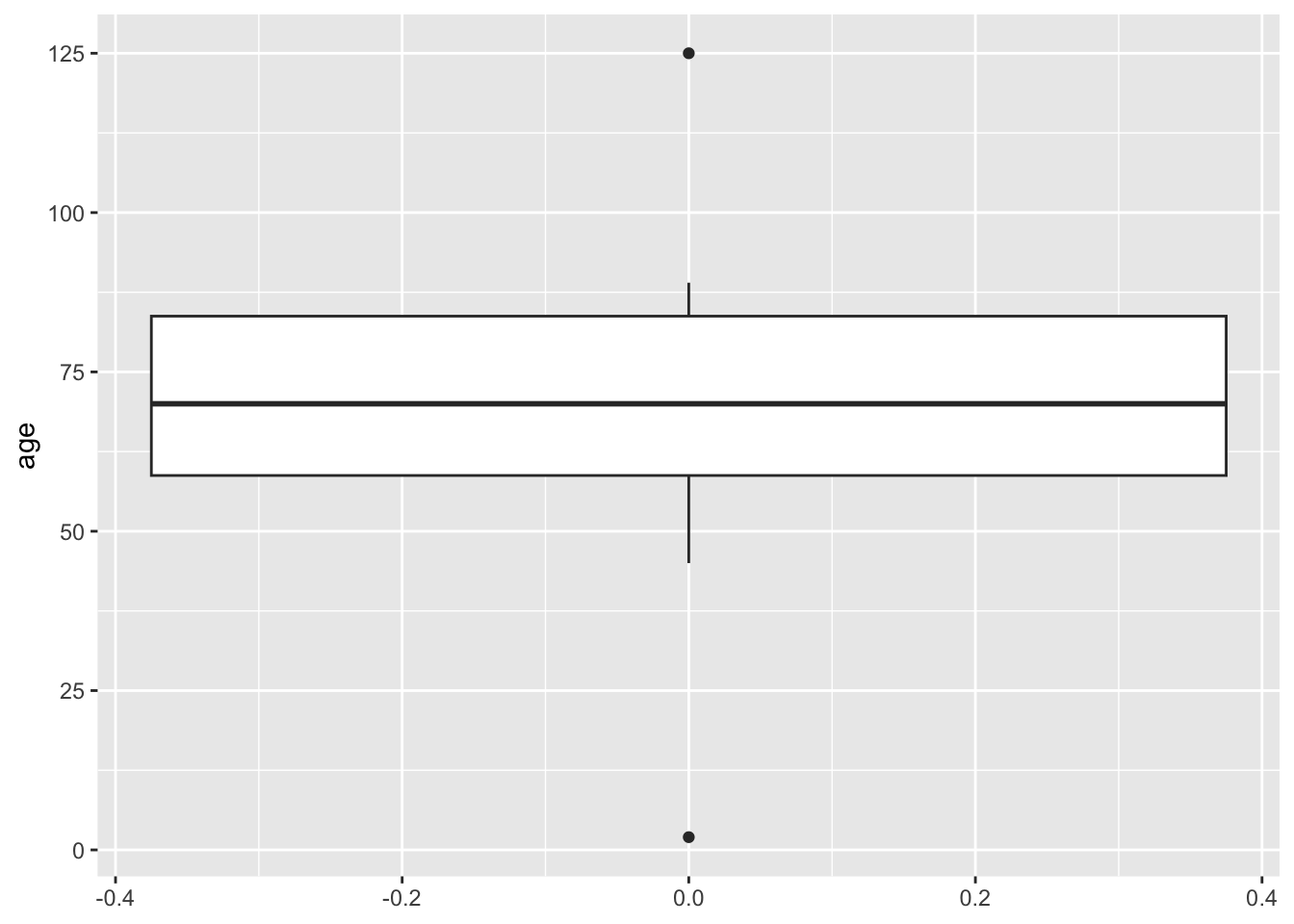
Can you see summary statistics mapped here?
Lets plot the mean (as it is a value that is not reflected in a boxplot!)
ggplot(data, aes(x = age)) +
  geom_boxplot() +
  coord_flip() +
geom_vline(xintercept = Mean, color = "blue", linetype = "dashed", size = 1) 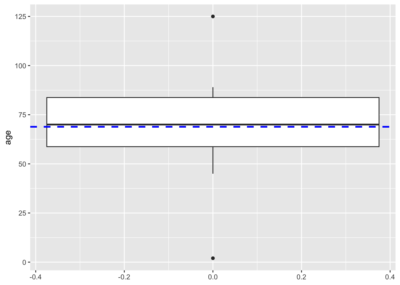
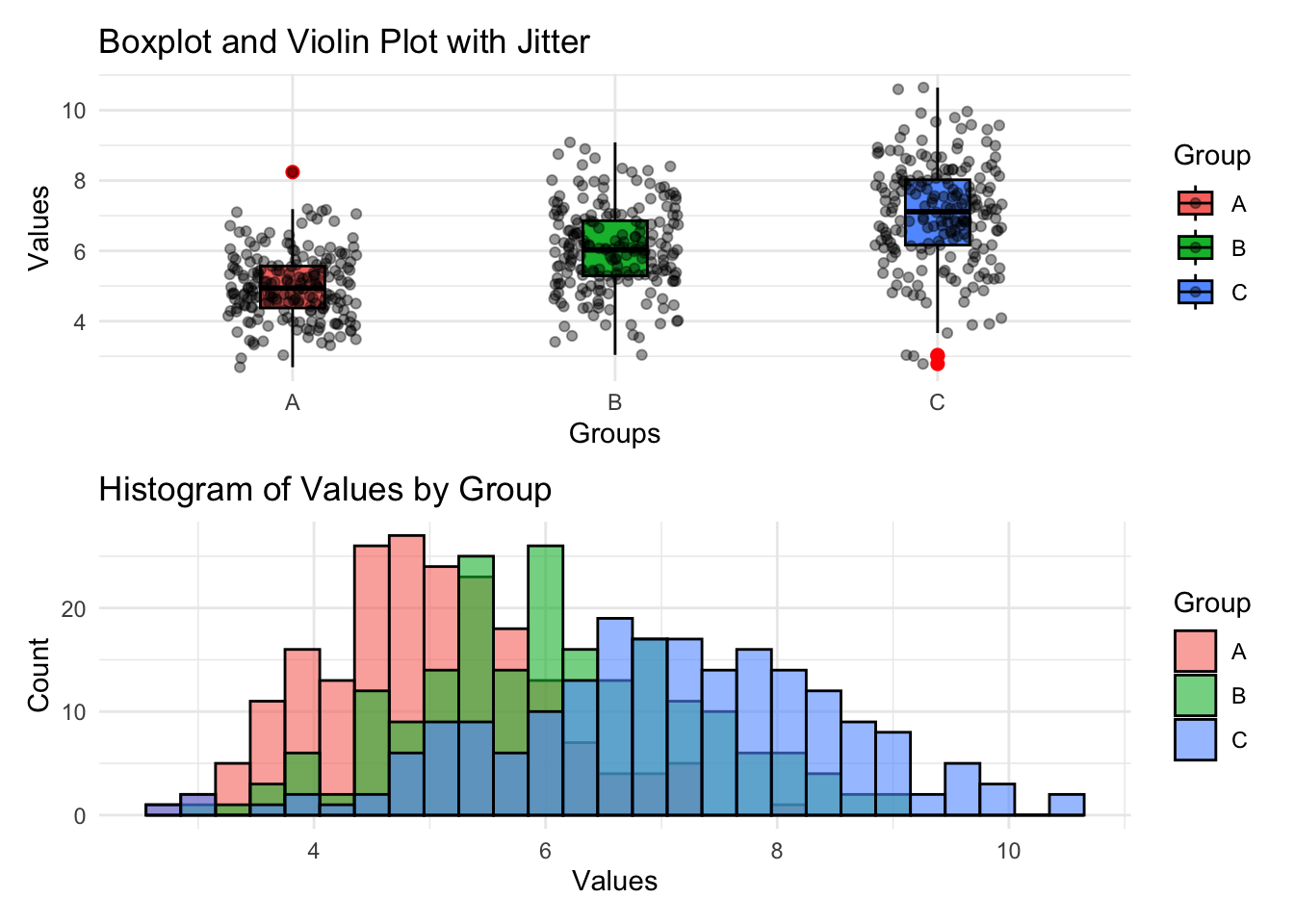
Bit more advanced! (add another geom layer, in this case geom_jitter. What does it do? How is it different from geom_point?)
# Load ggplot2
library(ggplot2)

# Sample data
set.seed(123)
data <- data.frame(
  Group = rep(c("A", "B", "C"), each = 200),
  Value = c(rnorm(200, mean = 5, sd = 1),
            rnorm(200, mean = 6, sd = 1.2),
            rnorm(200, mean = 7, sd = 1.5))
)

# Combined Plot
p1 <- ggplot(data, aes(x = Group, y = Value, fill = Group)) +
  # Violin + Boxplot + Jitter
  geom_boxplot(width = 0.2, outlier.color = "red", outlier.size = 2, colour = "black") +
  geom_jitter(position = position_jitter(0.2), color = "black", alpha = 0.4) + #scatter plot but in random positions, check geom_point() and see
  labs(title = "Boxplot and Violin Plot with Jitter", x = "Groups", y = "Values") +
  theme_minimal()

p2 <- ggplot(data, aes(x = Value, fill = Group)) +
  # Histogram
  geom_histogram(alpha = 0.6, position = "identity", binwidth = 0.3, colour = "black") +
  labs(title = "Histogram of Values by Group", x = "Values", y = "Count") +
  theme_minimal()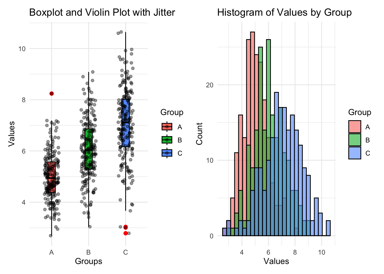
Also, maybe we want to understand how the distribution varies by more groups. We can use facets:
library(gapminder)

# Box plot with facets by year
ggplot(gapminder, aes(x = continent, y = lifeExp, fill = continent)) +
  geom_boxplot() +
  facet_wrap(~ year) +  # Create facets for each year
  labs(title = "Life Expectancy Across Continents by Year",
       x = "Continent",
       y = "Life Expectancy") +
  theme_minimal() + #just to make it nice
  theme(axis.text.x = element_text(angle = 45, hjust = 1))  # Rotate x-axis labels - just to make it nice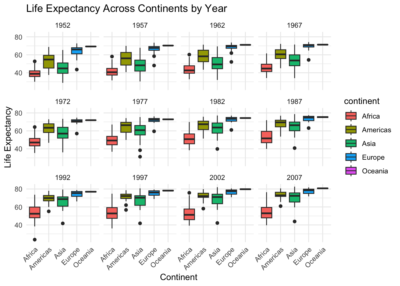
What is happening here? View(gapminder) dataset. If we focus on 1952 year, extract the necessary values to create the boxplot for Africa.
── Attaching core tidyverse packages ──────────────────────── tidyverse 2.0.0 ──
✔ dplyr     1.1.2     ✔ readr     2.1.4
✔ forcats   1.0.0     ✔ stringr   1.5.0
✔ lubridate 1.9.2     ✔ tibble    3.2.1
✔ purrr     1.0.1     ✔ tidyr     1.3.0
── Conflicts ────────────────────────────────────────── tidyverse_conflicts() ──
✖ dplyr::filter() masks stats::filter()
✖ dplyr::lag()    masks stats::lag()
ℹ Use the conflicted package (<http://conflicted.r-lib.org/>) to force all conflicts to become errors
Subgroup <- gapminder %>%
filter(year == "1952") %>%
filter(continent == "Africa")
#data wrangling - can learn more from Introduction exercise on data wrangling
Median <- median(Subgroup$lifeExp)
Median[1] 38.833Does it match the plot? Continue with the rest of parameters (IQR, mean, quantile)