# Install required libraries (if not already installed)
#install.packages(c("ggplot2", "corrplot", "ggcorrplot", "PerformanceAnalytics", "GGally", "psych", "corrr"))

# Load necessary libraries
library(ggplot2)
library(corrplot)
library(ggcorrplot)
library(PerformanceAnalytics)
library(GGally)
library(psych)
library(corrr)Correlation - R
As you have learnt throughout these modules, Python and R offer packages and libraries that contain already predefined functions ready to implement into your code. For you to see the breadth of possibilities out there, here is an example of different ways in whcih to describe and learn about the correlation matrix of your dataset.
To assess the association between two variables, you can produce a scatter plot like below:
set.seed(123)
x <- rnorm(100)
y <- x + rnorm(100, sd = 0.5)

ggplot(data = data.frame(x, y), aes(x = x, y = y)) +
  geom_point(color = "blue", size = 2) +
  geom_smooth(method = "lm", color = "red", se = FALSE) +
  labs(title = "Correlation Plot with ggplot2",
       x = "X values", y = "Y values") +
  theme_minimal()
`geom_smooth()` using formula = 'y ~ x'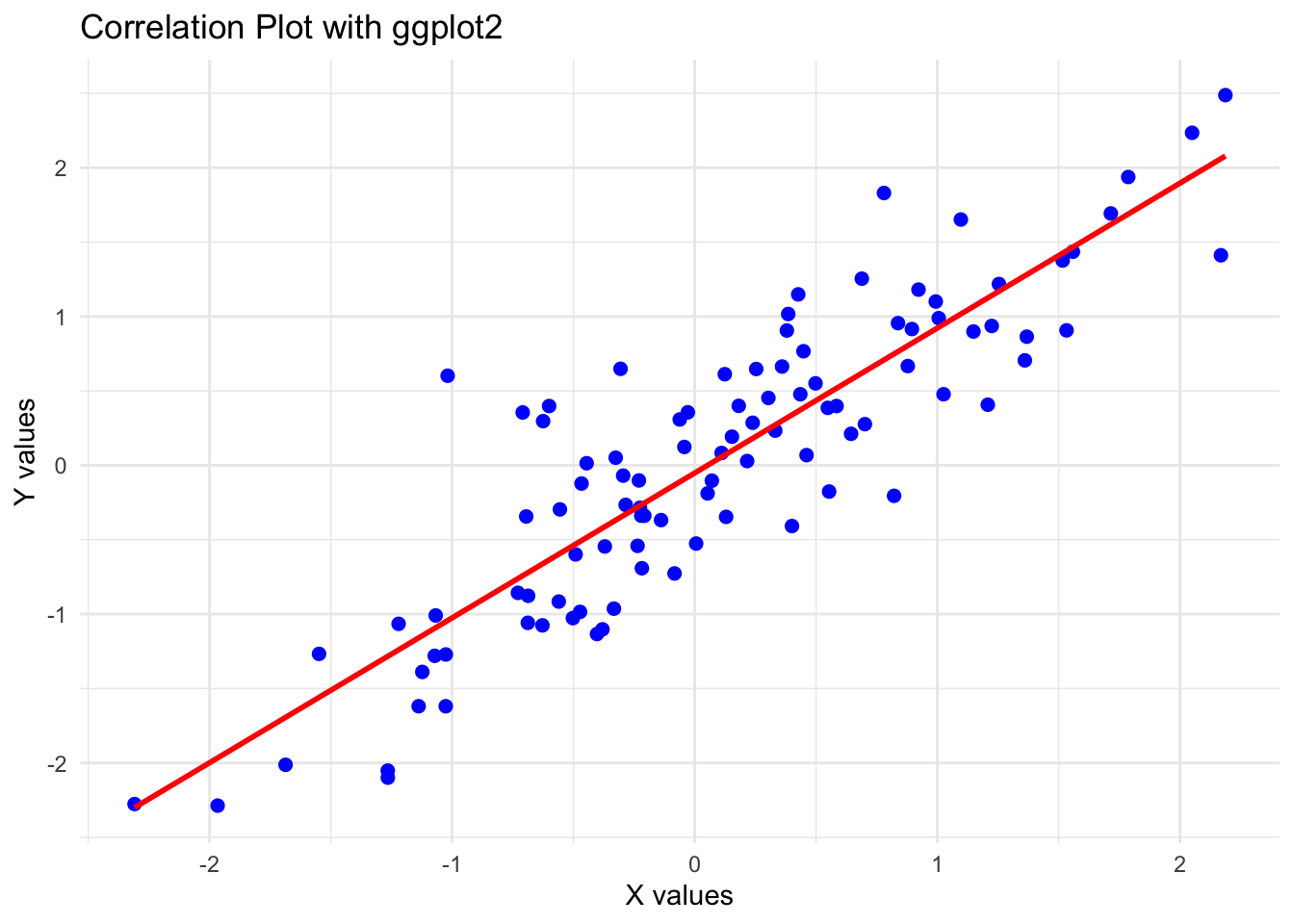
Now we are going to produce the correlation matrix, where in a go, you get insight of all the association happening in your dataset.For this we are going to use the mtcars data (A built-in dataset that contains measurements on 11 different attributes for 32 different cars). More specifically, the chosen variables are:
mpg (Miles per Gallon): Represents the fuel efficiency of the car. Higher values, better efficiency.
disp (Displacement): Represents the engine displacement, which is the total volume of all the cylinders in the engine.
hp (Horsepower): Represents the power output of the car’s engine.
wt (Weight): Represents the weight of the car.
data <- mtcars[, c("mpg", "disp", "hp", "wt")]But first, produce plots of all the two variable associations combinations in the features studied c("mpg", "disp", "hp", "wt"). How many plots do you need?
Can you calculate the correlation between them? Remember there are different ways in which to calculate correlation https://www.sthda.com/english/wiki/correlation-test-between-two-variables-in-r and you can specify the type in your code cor(x, y, method = c("pearson", "kendall", "spearman"))
Now that you know what to expect, lets proceed with the correlation matrices (same thing as above, but all in a go!):
—–corrplot Correlation Matrix —–
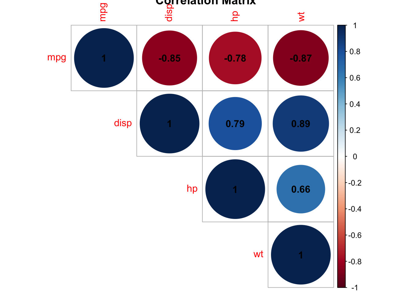
—–corrplot Correlation Matrix —–
ggcorrplot(cor_matrix,
           method = "square",
           type = "lower",
           lab = TRUE,
           title = "mtcars",
           lab_size = 3) +
  theme_minimal()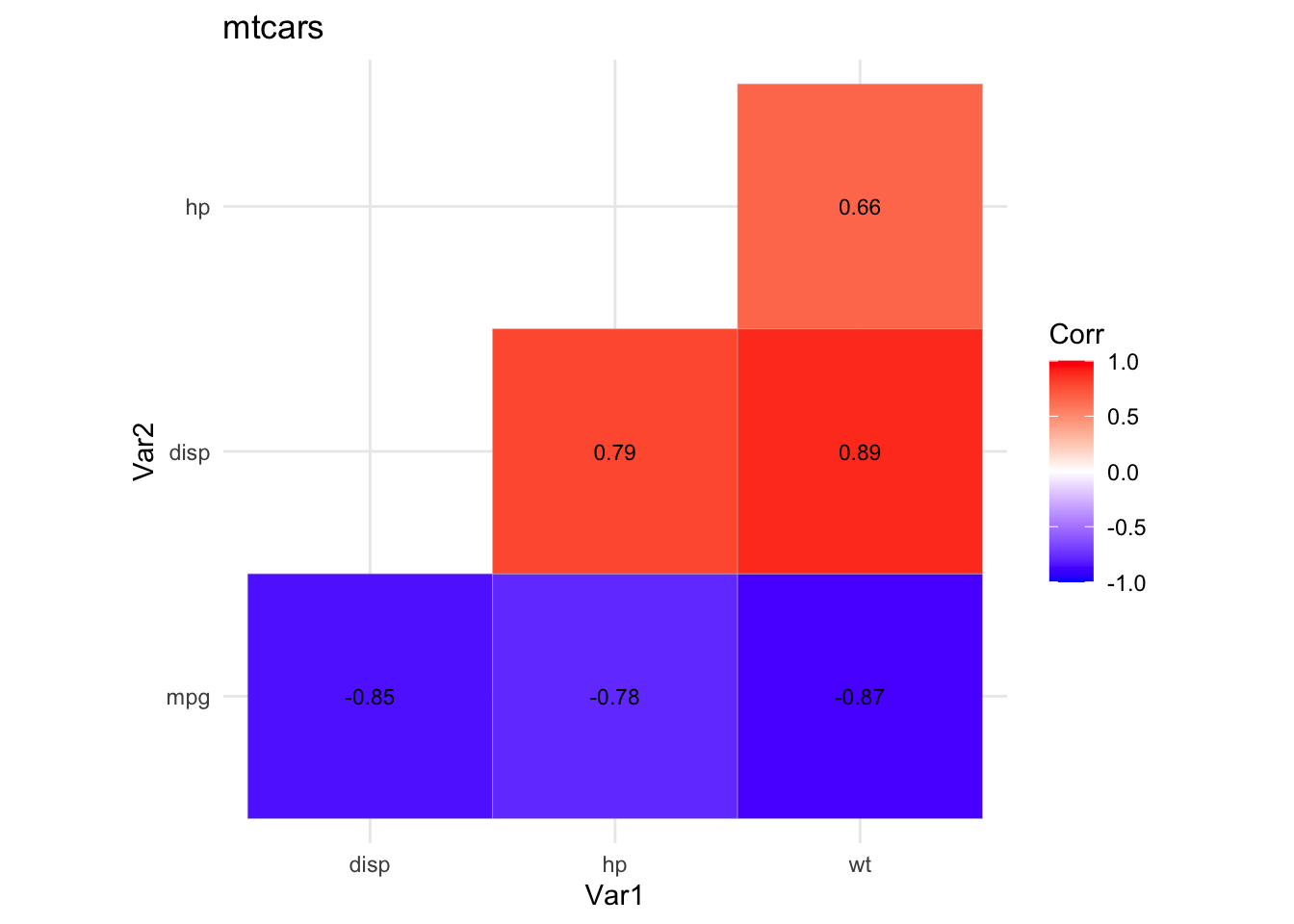
—–PerformanceAnalytics Pairwise Correlation Plot —–
chart.Correlation(data, histogram = TRUE, pch = 19)Warning in par(usr): argument 1 does not name a graphical parameter
Warning in par(usr): argument 1 does not name a graphical parameter
Warning in par(usr): argument 1 does not name a graphical parameter
Warning in par(usr): argument 1 does not name a graphical parameter
Warning in par(usr): argument 1 does not name a graphical parameter
Warning in par(usr): argument 1 does not name a graphical parameter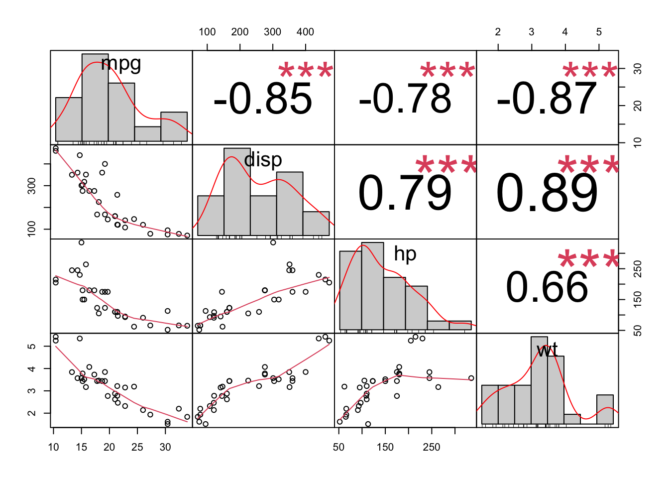
###—–GGally Pairwise Correlation Plot —–
ggpairs(data,
        title = "Pairwise Correlation Plot with GGally",
        lower = list(continuous = wrap("smooth", method = "lm")),
        upper = list(continuous = wrap("cor", size = 3)))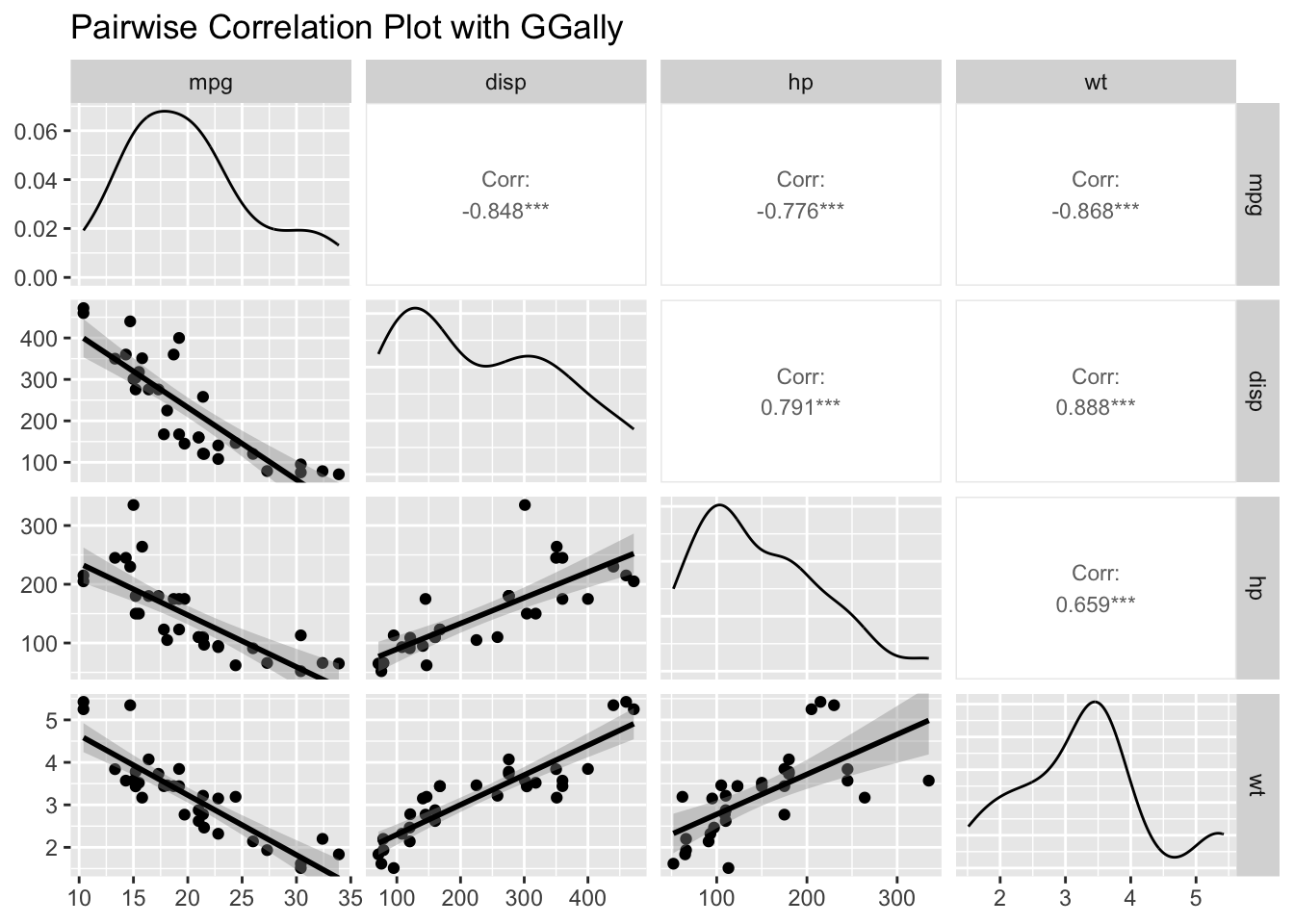
###—– psych Enhanced Pairwise Correlation Plot —–
pairs.panels(data,
             method = "pearson",
             hist.col = "lightblue",
             density = TRUE,
             ellipses = TRUE)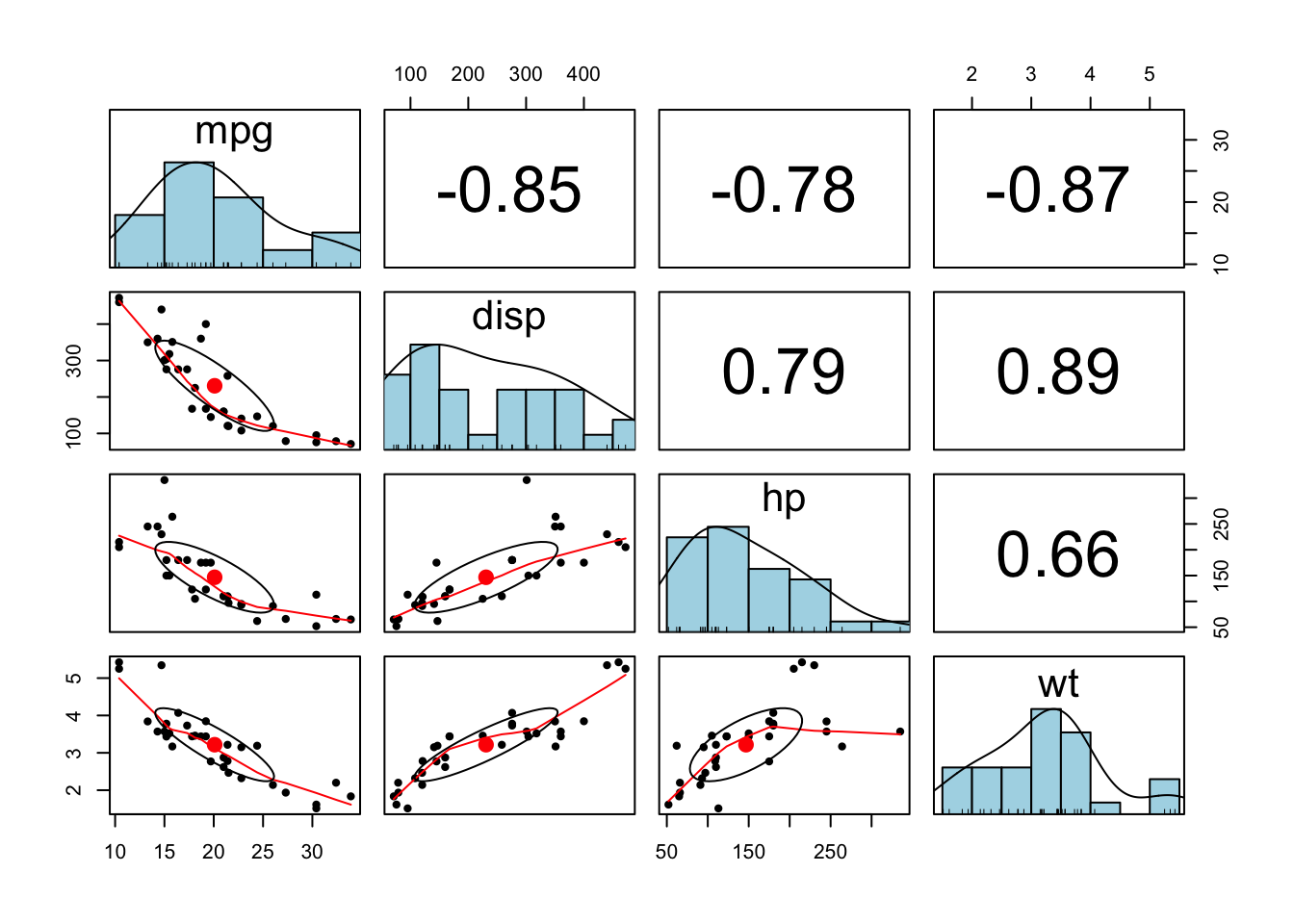
###—– Base R Heatmap —–
# ----- 8. Base R Heatmap -----
heatmap(cor_matrix, symm = TRUE,
        main = "Correlation Heatmap",
        col = colorRampPalette(c("red", "white", "blue"))(20))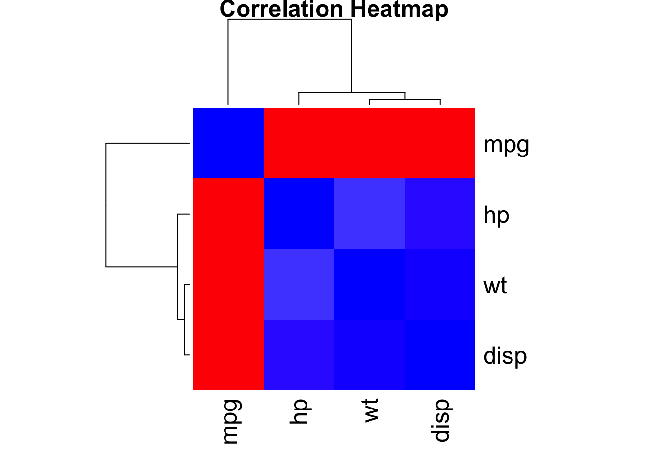
# ----- 10. corrr Tidy Correlation -----
cor_matrix_tidy <- correlate(data)
Correlation computed with
• Method: 'pearson'
• Missing treated using: 'pairwise.complete.obs' term mpg disp hp wt
1 mpg -.85 -.78 -.87
2 disp -.85 .79 .89
3 hp -.78 .79 .66
4 wt -.87 .89 .66 # Network-style correlation plot
cor_matrix_tidy %>%
network_plot(min_cor = 0.3)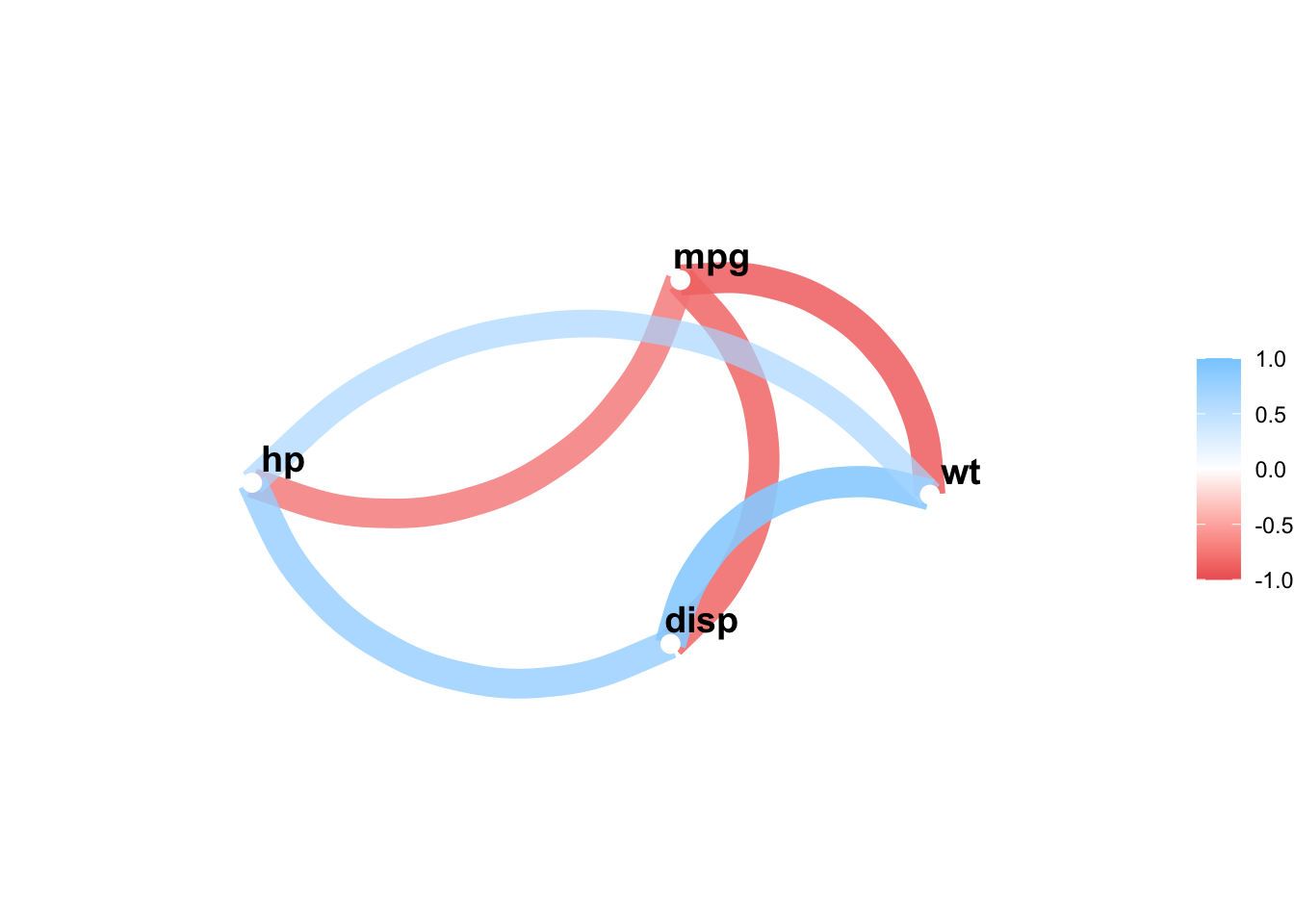
What are your insights? Do they make sense? Remember:
mpg (Miles per Gallon): Represents the fuel efficiency of the car. Higher values, better efficiency.
disp (Displacement): Represents the engine displacement, which is the total volume of all the cylinders in the engine.
hp (Horsepower): Represents the power output of the car’s engine.
wt (Weight): Represents the weight of the car.