Visualize higher dimensional associations
—– 1. Two Categorical Variables —–
Example data for two categorical variables
data_cat <- data.frame(
  Gender = c("Male", "Female", "Male", "Female", "Male", "Female"),
  Preference = c("A", "B", "A", "A", "B", "B")
)
# Bar plot
p1 <- ggplot(data_cat, aes(x = Gender, fill = Preference)) +
geom_bar(position = "dodge") +
labs(title = "Preference by Gender", x = "Gender", y = "Count") +
theme_minimal()
p1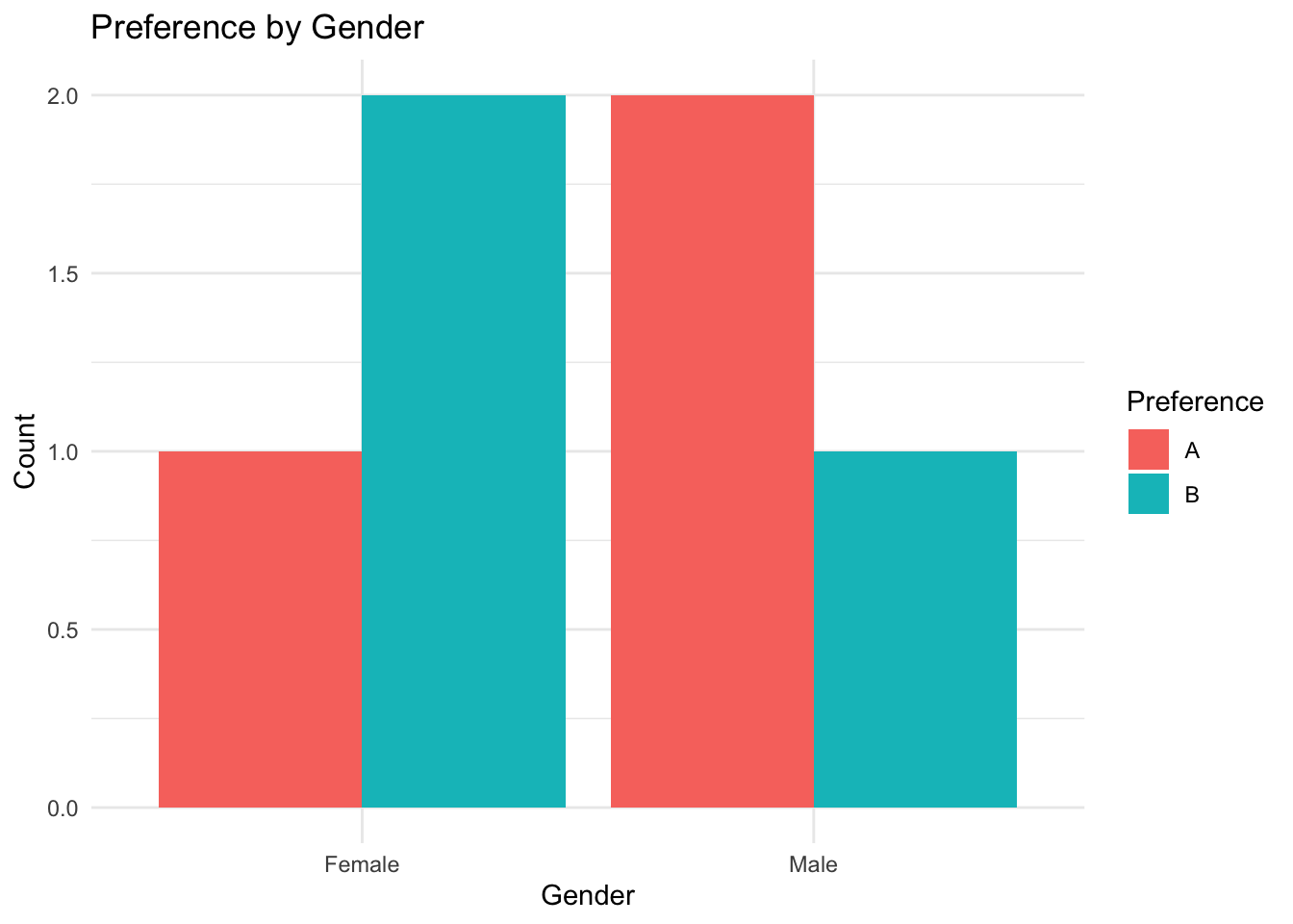
—– 2. Two Numerical Variables —–
Example data for two numerical variables
data_num <- data.frame(
  Age = c(21, 25, 30, 35, 40, 45),
  Salary = c(3000, 3200, 4000, 5000, 6000, 6500)
)
# Scatter plot
p2 <- ggplot(data_num, aes(x = Age, y = Salary)) +
geom_point(color = "blue", size = 3) +
labs(title = "Scatter Plot: Age vs Salary", x = "Age", y = "Salary") +
theme_minimal()
p2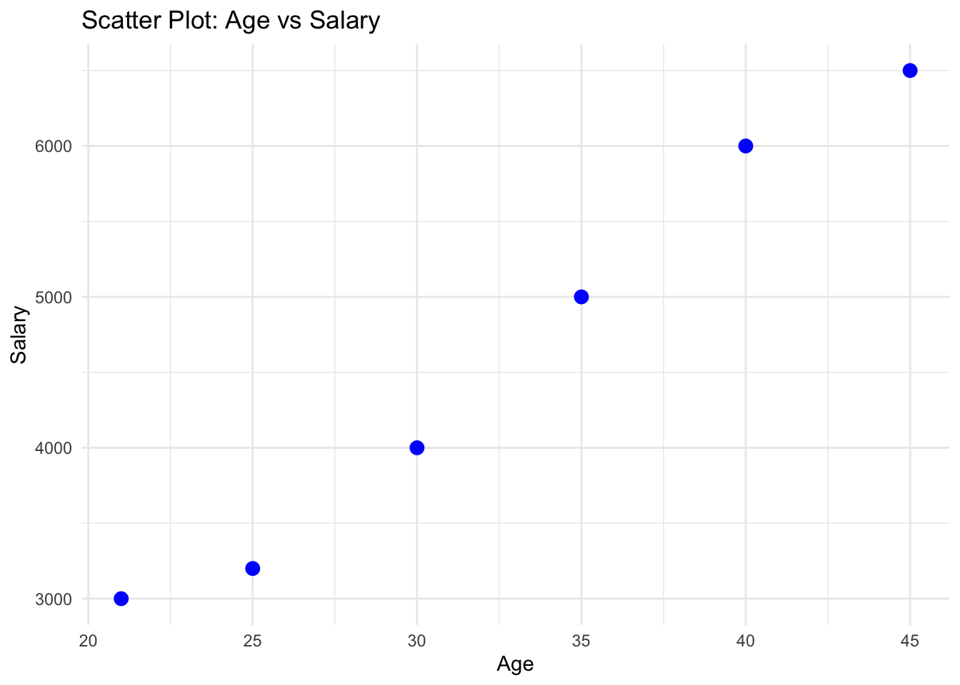
—– 3. Categorical and Numerical Variable —–
Example data for a categorical and a numerical variable
data_cat_num <- data.frame(
  Group = c("A", "A", "B", "B", "C", "C"),
  Score = c(80, 85, 78, 82, 90, 95)
)

# Box plot
p3 <- ggplot(data_cat_num, aes(x = Group, y = Score, fill = Group)) +
  geom_boxplot() +
  labs(title = "Box Plot: Score by Group", x = "Group", y = "Score") +
  theme_minimal()

p3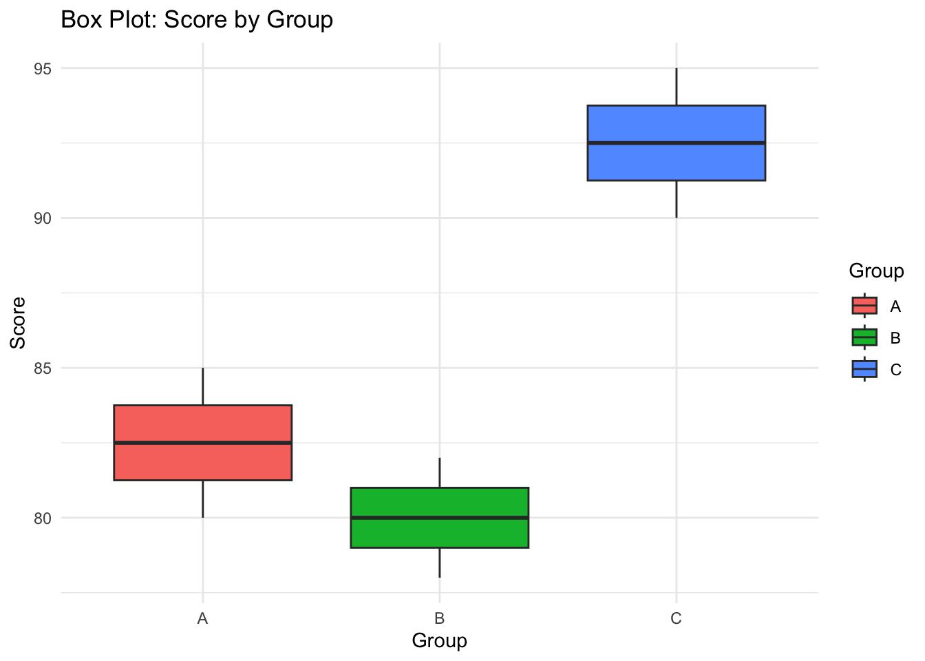
In the histogram and boxplot exercise, you added an extra layer (graph) to a similar plot that allowed us to overlay the exact data points. Inlude it in this example
#p3_new <- ggplot(data_cat_num, aes(x = Group, y = Score, fill = Group)) +
#  geom_boxplot() +
#  # ------------- #
#  labs(title = "Box Plot: Score by Group", x = "Group", y = "Score") +
#  theme_minimal()

#p3_new
—– 4. Three Variables (Categorical + Numerical + Numerical) —–
Example data for three variables (by overlying an exta aesthetic - colour - we can now acknowledge three different variables)
data_three <- data.frame(
  Age = c(21, 25, 30, 35, 40, 45),
  Salary = c(3000, 3200, 4000, 5000, 6000, 6500),
  Gender = c("Male", "Female", "Male", "Female", "Male", "Female")
)

p4 <- ggplot(data_three, aes(x = Age, y = Salary, color = Gender)) +
  geom_point(size = 3) +
  labs(title = "Scatter Plot: Age vs Salary by Gender", x = "Age", y = "Salary") +
  theme_minimal()

p4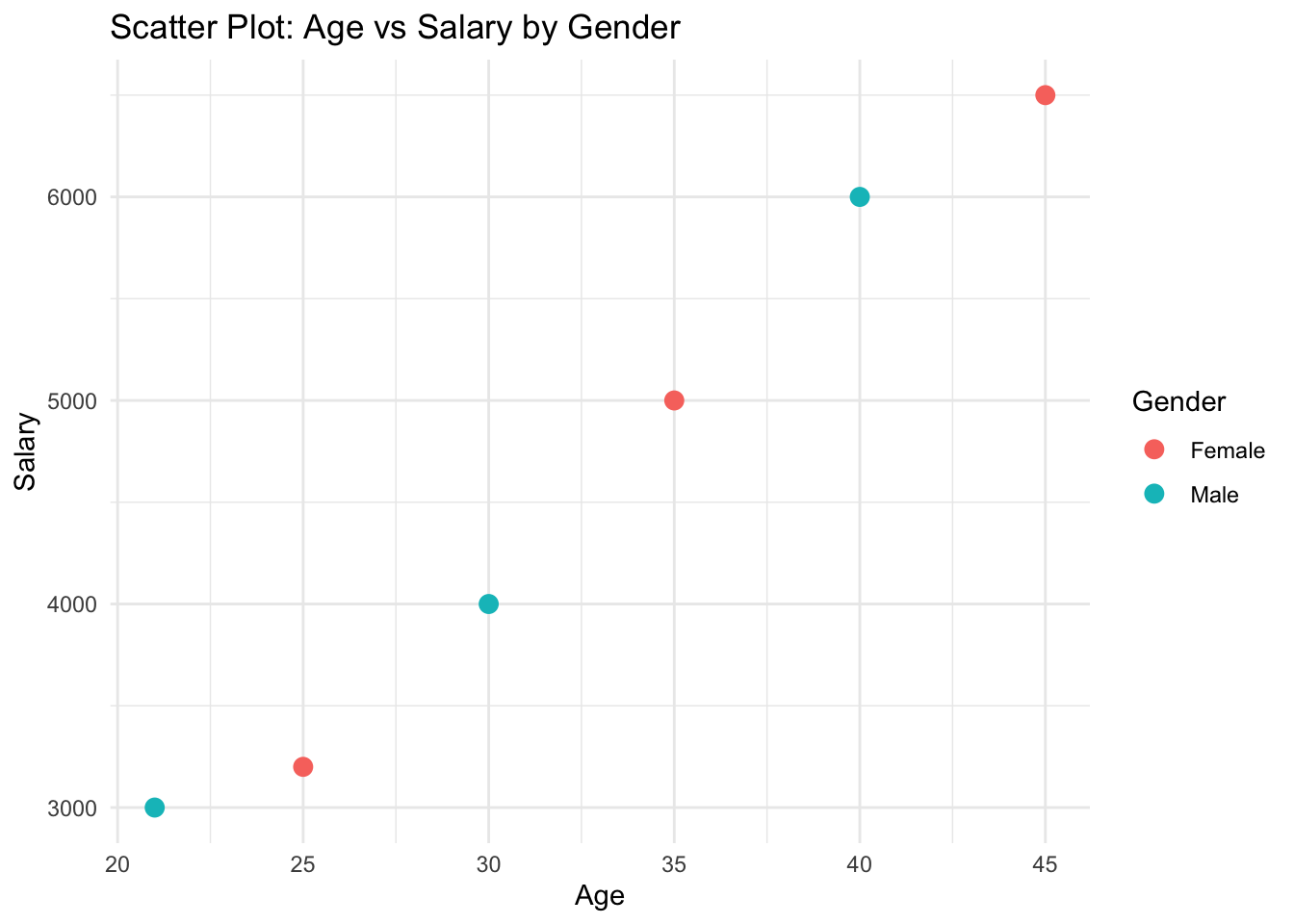
—– 5. Three Variables (Two Numerical + One Categorical) —–
Example data for faceted scatter plot
data_facet <- data.frame(
  Age = c(21, 25, 30, 35, 40, 45, 21, 25, 30, 35, 40, 45),
  Salary = c(3000, 3200, 4000, 5000, 6000, 6500, 3100, 3300, 4100, 5100, 6100, 6600),
  Gender = rep(c("Male", "Female"), each = 6)
)

# Faceted scatter plot
p5 <- ggplot(data_facet, aes(x = Age, y = Salary)) +
  geom_point(size = 3, color = "blue") +
  facet_wrap(~ Gender) +
  labs(title = "Faceted Scatter Plot: Age vs Salary by Gender", x = "Age", y = "Salary") +
  theme_minimal()

p5