The following object is masked from 'package:ggplot2':

    last_plot
The following object is masked from 'package:stats':

    filter
The following object is masked from 'package:graphics':

    layout
# Step 1: Generate made-up dataset.seed(42)# For reproducibilityn<-200x1<-rnorm(n)x2<-rnorm(n)z<--0.5+1.2*x1+1.5*x2# Linear combinationprob<-1/(1+exp(-z))# Logistic function for probabilitiesclass<-rbinom(n, 1, prob)# Generate binary classes (0 or 1)# Combine into a data framedata<-data.frame(x1 =x1, x2 =x2, class =factor(class))
# Step 2: Fit a logistic regression modelmodel<-glm(class~x1+x2, data =data, family =binomial)
# Step 3: Create a grid for predictionsgrid_x1<-seq(min(data$x1)-0.5, max(data$x1)+0.5, length.out =100)grid_x2<-seq(min(data$x2)-0.5, max(data$x2)+0.5, length.out =100)grid<-expand.grid(x1 =grid_x1, x2 =grid_x2)grid$prob<-predict(model, newdata =grid, type ="response")
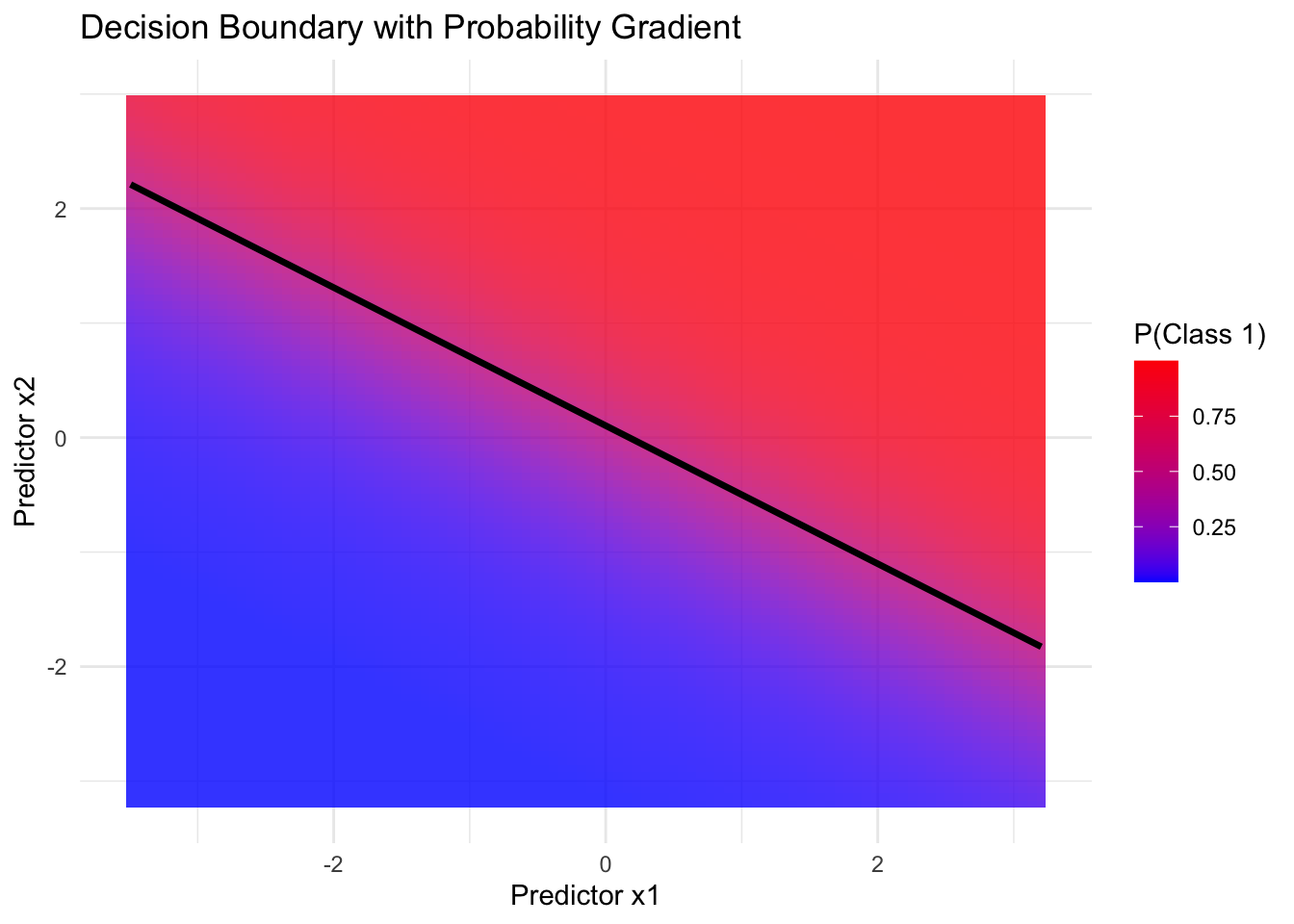
# Step 5: Plot 1 - Decision boundary with probabilitiesplot1<-ggplot()+geom_tile(data =grid, aes(x =x1, y =x2, fill =prob), alpha =0.8)+scale_fill_gradient(low ="blue", high ="red", name ="P(Class 1)")+geom_contour(data =grid, aes(x =x1, y =x2, z =prob), breaks =0.5, color ="black", size =1.2)+labs( title ="Decision Boundary with Probability Gradient", x ="Predictor x1", y ="Predictor x2")+theme_minimal()
Warning: Using `size` aesthetic for lines was deprecated in ggplot2 3.4.0.
ℹ Please use `linewidth` instead.
# Step 6: Plot 2 - Example data with decision thresholdplot2<-ggplot(data, aes(x =x1, y =x2))+geom_tile(data =grid, aes(x =x1, y =x2, fill =prob), alpha =0.8)+scale_fill_gradient(low ="blue", high ="red", name ="P(Class 1)")+geom_point(aes(shape =class, color =class), size =3, alpha =0.7)+#scale_color_manual(values = c("cyan", "red"), name = "Class") +geom_contour(data =grid, aes(x =x1, y =x2, z =prob), breaks =0.5, color ="black", size =1.2)+labs( title ="Example Data with Decision Threshold", x ="Predictor x1", y ="Predictor x2")+theme_minimal()
# Step 7: Plot 3 - 3D surface using plotlyz_matrix<-matrix(grid$prob, nrow =length(grid_x1), ncol =length(grid_x2))plot3<-plot_ly( x =grid_x1, y =grid_x2, z =z_matrix, type ="surface", colors =c("blue", "yellow"))%>%layout( title ="3D Logistic Surface Plot", scene =list( xaxis =list(title ="Predictor x1"), yaxis =list(title ="Predictor x2"), zaxis =list(title ="P(Class 1)")))# Step 8: Display plotsprint(plot1)# 2D decision boundary with probabilities
print(plot2)# 2D decision threshold with example data