(3) Best Fit Line
Load diabetes dataset (already available by installing package mlbench). This is a toy dataset that has been extensively used in many machine learning examples
data("PimaIndiansDiabetes")In the environment now you should see PimaIndiansDiabetes dataframe loaded
Lets now select only two of this columns age and glucose and store it as a new dataframe
Lets implement this loss function in R and test it with our diabetes data.
Load diabetes dataset, lets make the dataset even smaller so we can properly understand
data("PimaIndiansDiabetes")

Data <- PimaIndiansDiabetes %>%
  select(age, glucose, mass) %>%
  add_rownames(var = "Patient ID")
Warning: `add_rownames()` was deprecated in dplyr 1.0.0.
ℹ Please use `tibble::rownames_to_column()` instead.DataSmaller <- Data[1:3,]
x <- DataSmaller$age
y <- DataSmaller$glucoseSo we have narrowed down that we are continuing exploring MSE loss function to identify the line of best fit. MSE in the end can also be written as:
\[ \text{MSE} = \frac{1}{m} \sum_{i=1}^{m} \left( y_i - \left( \hat{\beta}_0 + \hat{\beta}_1 x_i \right) \right)^2 \] Because the predicted y comes out of this model! So they mean the same thing.
PAUSE for understanding!
This can be coded like this:
mse_practical <- function(beta0, beta1, x, y, m) {
  (1 / m) * sum((y - (beta0 + beta1 * x))^2)
}
Put it to test with beta values B0 = 3 and B1 = 5 , then try with B0 = 4 and B1 = 7. Do it in a piece of paper by hand too. Remember, we already have the y (outcome label - glucose), x (glucose) and m (number of samples) defined.
age <- DataSmaller$age
glucose <- DataSmaller$glucose
DataPoints <- length(x)

mse_practical(3, 5, age, glucose, DataPoints)
[1] 5584.667Remember this is the same as:
mse_practical(beta0 = 3, beta1 = 5, x = age, y= glucose, m =DataPoints)[1] 5584.667Now calculate it by hand! Use R as help (big numbers we are dealing with, but make sure you get the concept)
 Repeat process with B0 = 4 and B1 = 7. Figure continued here:
((148 - (253))^2 + (85 - (158))^2 + (183 - (163))^2)/3
((148 - (253))^2 + (85 - (158))^2 + (183 - (163))^2)/3[1] 5584.667Same as above!
Now do the same for B0 = 4 and B1 = 7.
Click here to reveal the solution
mse_practical(beta0 = 4, beta1 = 7, x = age, y= glucose, m =DataPoints)[1] 20985.67MSE is lower with parameters beta0 = 3, beta1 = 5, but is it the lowest it can go? Lets plot!
As you can see in this plot we have two lines with the slopes previously selected. The one with the lower loss fits the data better.
ggplot(DataSmaller, aes(x = age, y = glucose)) +
  geom_point() +
  geom_abline(slope = 3, intercept = 5, color = "blue", size = 1) +
  geom_abline(slope = 4, intercept = 7, color = "red", size = 1) +
  xlim(0, 80) +
  ylim(0, 300) +
  labs(title = "Different betas",
       x = "Age", y = "Glucose") +
  theme_minimal()
Warning: Using `size` aesthetic for lines was deprecated in ggplot2 3.4.0.
ℹ Please use `linewidth` instead.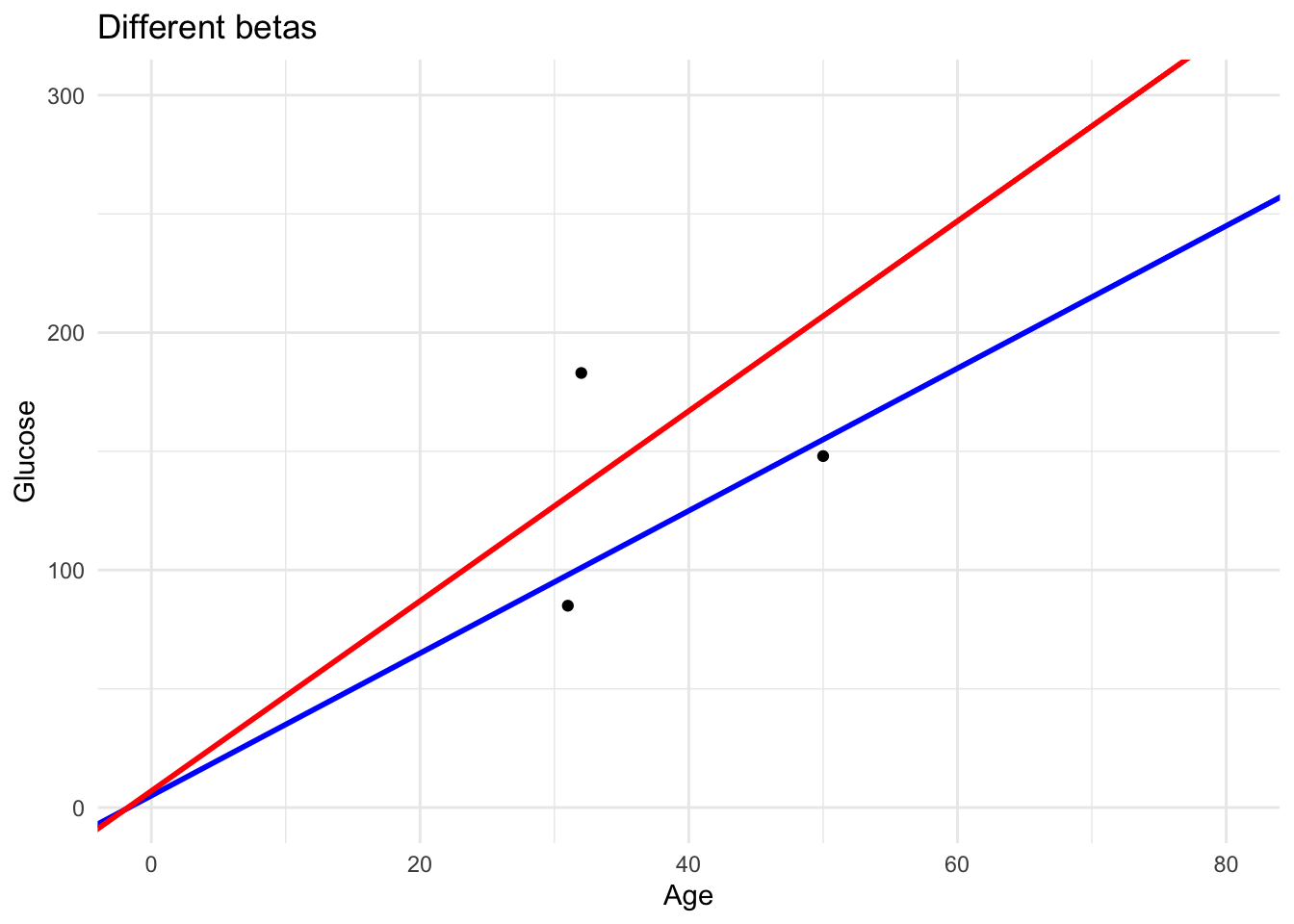
We could try this out for a range of different parameters. But, very slow.
For example lets go back to more data points:
DataSmaller <- Data[1:80,]

B0_values <- seq(60, 80, by = 10)
B1_values <- seq(0.5, 2, by = 0.5)

x_range <- seq(min(DataSmaller$age), max(DataSmaller$age), length.out = 100)


line_data <- expand.grid(B0 = B0_values, B1 = B1_values) %>%
  group_by(B0, B1) %>%
  do(data.frame(x = x_range, y = .$B0 + .$B1 * x_range)) %>%
  ungroup() %>%
  mutate(label = paste("B0 =", B0, ", B1 =", B1))
# Plot the original data points with the different regression lines

ggplot(DataSmaller, aes(x = age, y = glucose)) +
  geom_point(color = "black", size = 3) +  # Original data points
  geom_line(data = line_data, aes(x = x, y = y, color = label, linetype = label), size = 1) +
  labs(title = "Effect of Different B0 and B1 Values on the Regression Line",
       x = "Age (Predictor)", y = "Glucose (Response)",
       color = "Parameter Combination", linetype = "Parameter Combination") +
  theme_minimal()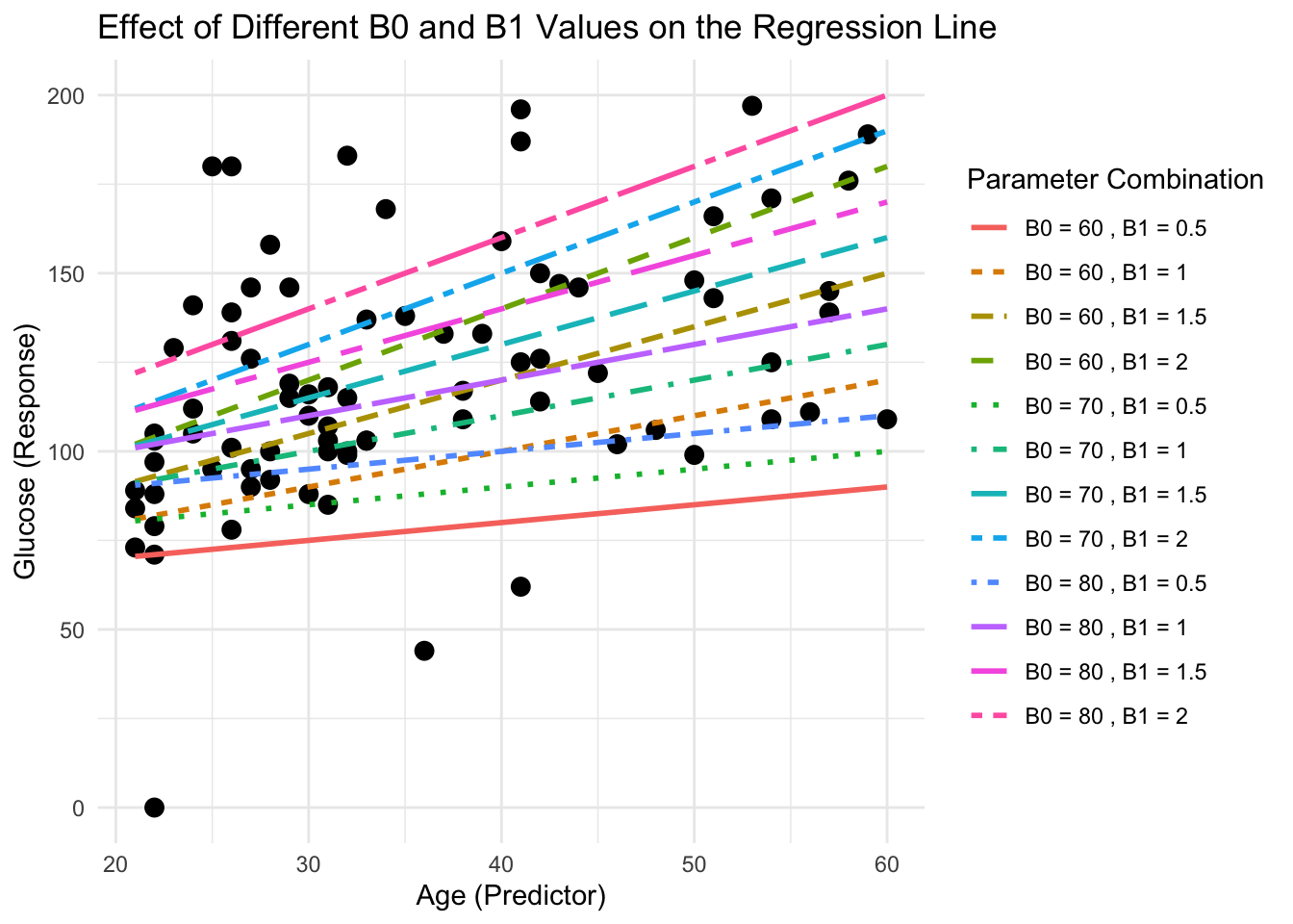
We cannot just keep trying randomly! How does the lm() function find out the parameters corresponding to the lowest MSE?
So we need a way in which to find the combination of parameters that yields the minimum MSE value (i.e the chosen loss function) and so the linear regression model that best fits the data points. But what is the minimum of the loss function?
Lets plot the function for us to understand it better! As we have three parameters that vary, to study the function, we need a 3D plot.
\[ MSE(\hat{\beta}_0, \hat{\beta}_1) = \frac{1}{m} \sum_{i=1}^{m} \left( y_i - \left( \hat{\beta}_0 + \hat{\beta}_1 x_i \right) \right)^2 \]
Using same betas as above but more spaced out:
We can calculate the MSE for each combination (same way as we did by hand before) and store it in a matrix
df <- expand_grid(B0_values, B1_values ) %>%
  rowwise() %>%
  mutate(MSE = mse_practical(beta0 = B0_values, beta1 = B1_values, x = DataSmaller$age, y = DataSmaller$glucose, m=length(DataSmaller$glucose)))

head(df)
# A tibble: 6 × 3
# Rowwise:
B0_values B1_values MSE
<dbl> <dbl> <dbl>
1 20 -5 82650.
2 20 -4.9 80554.
3 20 -4.8 78485.
4 20 -4.7 76444.
5 20 -4.6 74430.
6 20 -4.5 72443.Now lets plot this function!
What is the minimum MSE? This one! Roughly we can see that it corresponds to around x. What we also find from here is the idea that the minim point is the one at the bottom of the 3D curved surface.
[1] 1020.578# A tibble: 1 × 3
# Rowwise:
B0_values B1_values MSE
<dbl> <dbl> <dbl>
1 74.5 1.3 1021.fig <- plot_ly(
x = B1_values,
y = B0_values,
z = MSE_matrix, # Use the reshaped matrix
type = "surface"
) %>%
layout(
title = "3D Surface Plot of MSE",
scene = list(
xaxis = list(title = "B1_values"),
yaxis = list(title = "B0_values"),
zaxis = list(title = "MSE"),
camera = list(
eye = list(x = 2, y = 2, z = 1) # Adjust these values for the angle
)
)
)
# Add the minimum point
fig <- fig %>%
add_trace(
x = filter(df, MSE == min(df$MSE))$B1_values,
y = filter(df, MSE == min(df$MSE))$B0_values,
z = filter(df, MSE == min(df$MSE))$MSE,
mode = "markers",
type = "scatter3d",
marker = list(size = 10, color = "red"),
name = "Minimum MSE"
)
# Render the plot
figThese parameters are very similar to what we obtained from the lm() function (and would be the same if we had sampled the MSE at that accurate decimal point)
lm(glucose ~ age, data = DataSmaller)
Call:
lm(formula = glucose ~ age, data = DataSmaller)

Coefficients:
(Intercept)          age
      73.68         1.33